

Making Google Keep less of a disaster
A Google Keep redeisgn with new features and all
This third showcase project is an attempt at turning Google Keep into a Markdown-focused note-taking app with all of Google's benefits, including Gemini and Material Design.
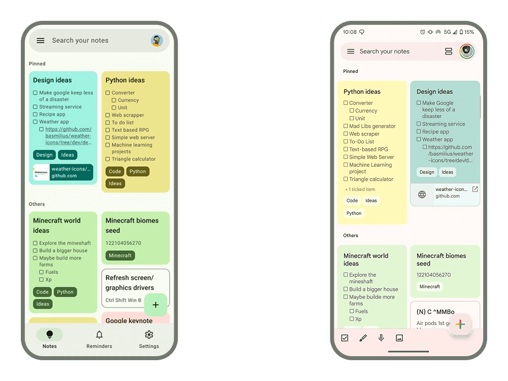
Notes view
The notes view got a visual overhaul. From the new toolbar to the new chips, everything is overall more visually appealing. I also refreshed the card colours, getting a little old.
The new editor
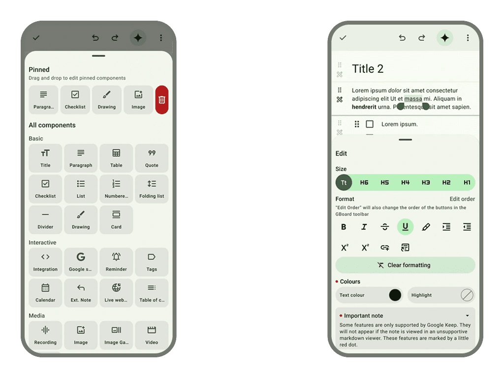
At the core of this conceptual Keep version is the all-new Markdown editor. This editor is packed with new features, the most important one being Markdown support. This enable compatibility with most popular note-taking apps like Notion and Obsidian. Another impressive feature seen all over the app is Components.
Basically, a Component is like a puzzle piece, the puzzle being your note. The nature of a Component can go to very simple (text, bulleted lists, cards) to more interactive blocks (Google service embed like Docs or Forms, calendar, live web page). It is important to acknowledge that most interactive components aren't compatible with classic Markdown viewers.
I also added loads more customisation options for the text within some Components, by bringing the Google Docs format sheet to Keep.


" result="qBHUP70UJ-2358326778-shadow-outset-0-flood"/><feComposite in="qBHUP70UJ-2358326778-shadow-outset-0-flood" in2="qBHUP70UJ-2358326778-shadow-outset-0-blur" operator="in" result="qBHUP70UJ-2358326778-shadow-outset-0"/></filter><path d="M 9.721 1.363 C 10.708 -0.515 13.502 -0.452 14.367 1.552 L 16.441 6.351 L 21.658 6.833 C 23.918 7.043 24.812 9.831 23.124 11.311 L 19.182 14.762 L 20.337 19.865 C 20.829 22.045 18.461 23.789 16.503 22.63 L 12 19.965 L 7.496 22.63 C 5.539 23.789 3.17 22.046 3.663 19.865 L 4.816 14.762 L 0.876 11.311 C -0.812 9.832 0.081 7.043 2.342 6.833 L 7.558 6.351 L 9.632 1.552 L 9.721 1.364 Z" id="qBHUP70UJ-2358326778"/><radialGradient cx="0.5" cy="0.5" gradient-transform="translate(0.5, 0.5) scale(1 1) translate(-0.5, -0.5)" id="d8nLU_Mrs-2358326778-radial-gradient" r="0.5"><stop offset="0" stop-color="rgb(245, 218, 137)"/><stop offset="1" stop-color="rgb(240, 196, 66)"/></radialGradient></defs><g d="M 9.721 1.363 C 10.708 -0.515 13.502 -0.452 14.367 1.552 L 16.441 6.351 L 21.658 6.833 C 23.918 7.043 24.812 9.831 23.124 11.311 L 19.182 14.762 L 20.337 19.865 C 20.829 22.045 18.461 23.789 16.503 22.63 L 12 19.965 L 7.496 22.63 C 5.539 23.789 3.17 22.046 3.663 19.865 L 4.816 14.762 L 0.876 11.311 C -0.812 9.832 0.081 7.043 2.342 6.833 L 7.558 6.351 L 9.632 1.552 L 9.721 1.364 Z M 11.205 2.223 C 11.505 1.53 12.492 1.53 12.791 2.223 L 15.064 7.485 C 15.189 7.774 15.463 7.973 15.778 8.001 L 21.499 8.53 C 22.253 8.6 22.558 9.535 21.989 10.034 L 17.671 13.814 C 17.434 14.022 17.329 14.342 17.398 14.65 L 18.662 20.237 C 18.829 20.974 18.03 21.553 17.379 21.167 L 12.439 18.242 C 12.167 18.081 11.829 18.081 11.557 18.242 L 6.617 21.167 C 5.965 21.553 5.168 20.974 5.334 20.238 L 6.598 14.651 C 6.667 14.344 6.563 14.023 6.325 13.815 L 2.009 10.033 C 1.439 9.535 1.744 8.6 2.499 8.53 L 8.22 8.001 C 8.535 7.973 8.808 7.774 8.933 7.485 L 11.205 2.224 Z" fill="transparent" height="23px" id="Yj0Y5oX6K" transform="translate(4 4)" width="24px"><mask height="131.3%" id="qBHUP70UJ-2358326778-shadow-mask" width="117.5%" x="-8.8%" y="-15.7%"><rect fill="white" height="100%" width="100%"/><use fill="black" href="%23qBHUP70UJ-2358326778"/></mask><g filter="url(%23qBHUP70UJ-2358326778-shadow-outset)" mask="url(%23qBHUP70UJ-2358326778-shadow-mask)"><use fill="black" href="%23qBHUP70UJ-2358326778" stroke-opacity="0" stroke-width="0" stroke="black"/></g><use fill="rgb(255, 255, 255)" height="23px" href="%23qBHUP70UJ-2358326778" id="qBHUP70UJ" width="24px"/><path d="M 9.491 0.52 C 9.791 -0.173 10.778 -0.173 11.077 0.52 L 13.35 5.781 C 13.475 6.071 13.749 6.269 14.064 6.298 L 19.784 6.827 C 20.539 6.897 20.844 7.832 20.275 8.331 L 15.957 12.111 C 15.72 12.318 15.615 12.639 15.684 12.947 L 16.948 18.534 C 17.115 19.271 16.316 19.849 15.665 19.464 L 10.725 16.539 C 10.453 16.378 10.114 16.378 9.843 16.539 L 4.903 19.464 C 4.251 19.849 3.453 19.271 3.62 18.534 L 4.884 12.948 C 4.953 12.64 4.849 12.32 4.611 12.111 L 0.295 8.33 C -0.275 7.832 0.03 6.897 0.785 6.827 L 6.506 6.298 C 6.821 6.269 7.094 6.071 7.219 5.781 L 9.491 0.521 Z" fill="url(%23d8nLU_Mrs-2358326778-radial-gradient)" height="19.586796340332533px" id="d8nLU_Mrs" transform="translate(1.714 1.703)" width="20.569305238606184px"/></g></svg>)
" result="c4iFQkgpx-3737712798-shadow-outset-0-flood"/><feComposite in="c4iFQkgpx-3737712798-shadow-outset-0-flood" in2="c4iFQkgpx-3737712798-shadow-outset-0-blur" operator="in" result="c4iFQkgpx-3737712798-shadow-outset-0"/></filter><path d="M 0 18.171 L 0 5.781 C 0 5.108 0 4.503 0.04 4 C 0.082 3.465 0.178 2.897 0.454 2.34 C 0.854 1.534 1.491 0.878 2.275 0.467 C 2.817 0.183 3.369 0.085 3.889 0.041 C 4.378 0 4.966 0 5.62 0 L 9.381 0 C 10.034 0 10.623 0 11.111 0.041 C 11.631 0.084 12.183 0.183 12.725 0.467 C 13.509 0.878 14.146 1.534 14.546 2.34 C 14.822 2.897 14.918 3.465 14.96 4 C 15 4.503 15 5.108 15 5.781 L 15 18.219 C 15 18.892 15 19.497 14.96 20 C 14.918 20.535 14.822 21.103 14.546 21.66 C 14.146 22.466 13.509 23.122 12.725 23.533 C 12.183 23.817 11.631 23.915 11.111 23.959 C 10.622 24 10.034 24 9.38 24 L 5.62 24 C 4.966 24 4.378 24 3.889 23.959 C 3.369 23.916 2.817 23.817 2.275 23.533 C 1.491 23.122 0.854 22.466 0.454 21.66 C 0.178 21.103 0.082 20.535 0.04 20 C 0 19.497 0 18.892 0 18.22 Z" id="c4iFQkgpx-3737712798"/><linearGradient id="v13Is8JPm-3737712798-linear-gradient" x1="0.49751243781094523" x2="0.5024875621890548" y1="0" y2="1"><stop offset="0" stop-color="rgb(233, 233, 252)"/><stop offset="1" stop-color="rgb(182, 182, 251)"/></linearGradient></defs><g d="M 0 18.171 L 0 5.781 C 0 5.108 0 4.503 0.04 4 C 0.082 3.465 0.178 2.897 0.454 2.34 C 0.854 1.534 1.491 0.878 2.275 0.467 C 2.817 0.183 3.369 0.085 3.889 0.041 C 4.378 0 4.966 0 5.62 0 L 9.381 0 C 10.034 0 10.623 0 11.111 0.041 C 11.631 0.084 12.183 0.183 12.725 0.467 C 13.509 0.878 14.146 1.534 14.546 2.34 C 14.822 2.897 14.918 3.465 14.96 4 C 15 4.503 15 5.108 15 5.781 L 15 18.219 C 15 18.892 15 19.497 14.96 20 C 14.918 20.535 14.822 21.103 14.546 21.66 C 14.146 22.466 13.509 23.122 12.725 23.533 C 12.183 23.817 11.631 23.915 11.111 23.959 C 10.622 24 10.034 24 9.38 24 L 5.62 24 C 4.966 24 4.378 24 3.889 23.959 C 3.369 23.916 2.817 23.817 2.275 23.533 C 1.491 23.122 0.854 22.466 0.454 21.66 C 0.178 21.103 0.082 20.535 0.04 20 C 0 19.497 0 18.892 0 18.22 Z M 1.667 5.829 C 1.667 4.389 1.667 3.669 1.939 3.118 C 2.179 2.634 2.561 2.241 3.032 1.995 C 3.567 1.714 4.267 1.714 5.667 1.714 L 9.333 1.714 C 10.733 1.714 11.433 1.714 11.968 1.995 C 12.439 2.241 12.821 2.634 13.061 3.118 C 13.333 3.669 13.333 4.389 13.333 5.829 L 13.333 18.171 C 13.333 19.611 13.333 20.331 13.061 20.882 C 12.821 21.366 12.439 21.759 11.968 22.005 C 11.433 22.286 10.733 22.286 9.333 22.286 L 5.667 22.286 C 4.267 22.286 3.567 22.286 3.032 22.005 C 2.561 21.759 2.179 21.366 1.939 20.882 C 1.667 20.331 1.667 19.611 1.667 18.171 Z M 10 21 L 5 21" fill="transparent" height="24px" id="lFyUJoSLp" transform="translate(8 4)" width="15px"><mask height="130.0%" id="c4iFQkgpx-3737712798-shadow-mask" width="128.0%" x="-14.0%" y="-15.0%"><rect fill="white" height="100%" width="100%"/><use fill="black" href="%23c4iFQkgpx-3737712798"/></mask><g filter="url(%23c4iFQkgpx-3737712798-shadow-outset)" mask="url(%23c4iFQkgpx-3737712798-shadow-mask)"><use fill="black" href="%23c4iFQkgpx-3737712798" stroke-opacity="0" stroke-width="0" stroke="black"/></g><use fill="rgb(255, 255, 255)" height="24px" href="%23c4iFQkgpx-3737712798" id="c4iFQkgpx" width="15px"/><path d="M 0 4.114 C 0 2.674 0 1.954 0.273 1.404 C 0.512 0.92 0.895 0.527 1.365 0.28 C 1.9 0 2.6 0 4 0 L 7.667 0 C 9.067 0 9.767 0 10.302 0.28 C 10.772 0.527 11.154 0.92 11.394 1.404 C 11.667 1.954 11.667 2.674 11.667 4.114 L 11.667 16.457 C 11.667 17.897 11.667 18.617 11.394 19.167 C 11.154 19.651 10.772 20.045 10.302 20.291 C 9.767 20.571 9.067 20.571 7.667 20.571 L 4 20.571 C 2.6 20.571 1.9 20.571 1.365 20.291 C 0.895 20.045 0.512 19.651 0.273 19.167 C 0 18.617 0 17.897 0 16.457 Z" fill="url(%23v13Is8JPm-3737712798-linear-gradient)" height="20.57142857142857px" id="v13Is8JPm" transform="translate(1.667 1.714)" width="11.666666706403106px"/><path d="M 5 0 L 0 0" fill="transparent" height="1px" id="E0DuNscgQ" stroke-dasharray="" stroke-linecap="round" stroke-linejoin="miter" stroke-miterlimit="10" stroke-width="0.75" stroke="rgb(122, 122, 184)" transform="translate(5 21)" width="4.999999999999972px"/></g></svg>)
" result="tElQXt6j6-310689846-shadow-outset-0-flood"/><feComposite in="tElQXt6j6-310689846-shadow-outset-0-flood" in2="tElQXt6j6-310689846-shadow-outset-0-blur" operator="in" result="tElQXt6j6-310689846-shadow-outset-0"/></filter><path d="M 10.144 0.001 C 10.309 0.001 10.72 -0.014 11.151 0.083 L 11.337 0.132 L 11.614 0.23 C 11.796 0.306 11.97 0.399 12.133 0.509 L 12.37 0.685 L 12.513 0.811 C 12.832 1.116 13.047 1.468 13.139 1.605 L 14.071 3.002 L 23 3.002 C 23.439 3.002 23.868 3.001 24.23 3.025 C 24.611 3.051 25.062 3.113 25.53 3.307 C 26.447 3.686 27.19 4.393 27.615 5.29 L 27.695 5.472 L 27.762 5.645 C 27.904 6.051 27.954 6.438 27.977 6.771 C 28 7.134 28 7.563 28 8.001 L 28 15.801 C 28 16.329 28.001 16.844 27.966 17.278 C 27.928 17.735 27.841 18.275 27.564 18.818 C 27.18 19.57 26.569 20.182 25.816 20.566 C 25.274 20.843 24.734 20.93 24.276 20.968 C 23.843 21.003 23.326 21.002 22.8 21.002 L 5.2 21.002 C 4.673 21.002 4.157 21.003 3.724 20.968 C 3.266 20.93 2.726 20.843 2.184 20.566 C 1.431 20.182 0.82 19.57 0.436 18.818 C 0.159 18.275 0.072 17.735 0.034 17.278 C 0 16.844 0 16.328 0 15.802 L 0 5.201 C 0 4.674 -0.001 4.158 0.034 3.725 C 0.072 3.267 0.159 2.727 0.436 2.185 C 0.819 1.432 1.431 0.82 2.184 0.436 C 2.726 0.16 3.266 0.072 3.724 0.036 C 4.157 0.001 4.674 0.001 5.2 0.001 Z" id="tElQXt6j6-310689846" transform="translate(0 0)"/><linearGradient id="vEdXsYgRl-310689846-linear-gradient" x1="0.49751243781094523" x2="0.5024875621890548" y1="0" y2="1"><stop offset="0" stop-color="rgb(163, 218, 245)"/><stop offset="1" stop-color="rgb(60, 168, 221)"/></linearGradient><linearGradient id="J6ukL2xrq-310689846-linear-gradient" x1="0.49751243781094523" x2="0.5024875621890548" y1="0" y2="1"><stop offset="0" stop-color="rgb(163, 218, 245)"/><stop offset="1" stop-color="rgb(94, 190, 238)"/></linearGradient></defs><g d="M 10.144 0.001 C 10.309 0.001 10.72 -0.014 11.151 0.083 L 11.337 0.132 L 11.614 0.23 C 11.796 0.306 11.97 0.399 12.133 0.509 L 12.37 0.685 L 12.513 0.811 C 12.832 1.116 13.047 1.468 13.139 1.605 L 14.071 3.002 L 23 3.002 C 23.439 3.002 23.868 3.001 24.23 3.025 C 24.611 3.051 25.062 3.113 25.53 3.307 C 26.447 3.686 27.19 4.393 27.615 5.29 L 27.695 5.472 L 27.762 5.645 C 27.904 6.051 27.954 6.438 27.977 6.771 C 28 7.134 28 7.563 28 8.001 L 28 15.801 C 28 16.329 28.001 16.844 27.966 17.278 C 27.928 17.735 27.841 18.275 27.564 18.818 C 27.18 19.57 26.569 20.182 25.816 20.566 C 25.274 20.843 24.734 20.93 24.276 20.968 C 23.843 21.003 23.326 21.002 22.8 21.002 L 5.2 21.002 C 4.673 21.002 4.157 21.003 3.724 20.968 C 3.266 20.93 2.726 20.843 2.184 20.566 C 1.431 20.182 0.82 19.57 0.436 18.818 C 0.159 18.275 0.072 17.735 0.034 17.278 C 0 16.844 0 16.328 0 15.802 L 0 5.201 C 0 4.674 -0.001 4.158 0.034 3.725 C 0.072 3.267 0.159 2.727 0.436 2.185 C 0.819 1.432 1.431 0.82 2.184 0.436 C 2.726 0.16 3.266 0.072 3.724 0.036 C 4.157 0.001 4.674 0.001 5.2 0.001 Z M 23 4.999 L 13.856 4.999 C 13.543 4.999 13.386 4.999 13.245 4.957 C 13.119 4.919 13.002 4.856 12.9 4.772 C 12.786 4.678 12.699 4.548 12.525 4.287 L 11.475 2.712 C 11.301 2.452 11.215 2.322 11.1 2.227 C 10.998 2.144 10.881 2.081 10.755 2.043 C 10.613 2 10.457 2 10.144 2 L 5.2 2 C 4.08 2 3.52 2 3.092 2.218 C 2.716 2.41 2.41 2.716 2.218 3.092 C 2 3.519 2 4.079 2 5.199 L 2 7.999 L 26 7.999 C 26 7.067 26 6.601 25.848 6.233 C 25.645 5.743 25.255 5.354 24.765 5.151 C 24.398 4.999 23.932 4.999 23 4.999 Z M 2 10 L 2 15.8 C 2 16.92 2 17.481 2.218 17.909 C 2.41 18.285 2.716 18.591 3.092 18.783 C 3.52 19 4.08 19 5.2 19 L 22.8 19 C 23.92 19 24.48 19 24.908 18.782 C 25.284 18.59 25.59 18.284 25.782 17.908 C 26 17.48 26 16.92 26 15.8 L 26 10 Z M 10.144 0.001 C 10.309 0.001 10.72 -0.014 11.151 0.083 L 11.337 0.132 L 11.614 0.23 C 11.796 0.306 11.97 0.399 12.133 0.509 L 12.37 0.685 L 12.513 0.811 C 12.832 1.116 13.047 1.468 13.139 1.605 L 14.071 3.002 L 23 3.002 C 23.439 3.002 23.868 3.001 24.23 3.025 C 24.611 3.051 25.062 3.113 25.53 3.307 C 26.447 3.686 27.19 4.393 27.615 5.29 L 27.695 5.472 L 27.762 5.645 C 27.904 6.051 27.954 6.438 27.977 6.771 C 28 7.134 28 7.563 28 8.001 L 28 15.801 C 28 16.329 28.001 16.844 27.966 17.278 C 27.928 17.735 27.841 18.275 27.564 18.818 C 27.18 19.57 26.569 20.182 25.816 20.566 C 25.274 20.843 24.734 20.93 24.276 20.968 C 23.843 21.003 23.326 21.002 22.8 21.002 L 5.2 21.002 C 4.673 21.002 4.157 21.003 3.724 20.968 C 3.266 20.93 2.726 20.843 2.184 20.566 C 1.431 20.182 0.82 19.57 0.436 18.818 C 0.159 18.275 0.072 17.735 0.034 17.278 C 0 16.844 0 16.328 0 15.802 L 0 5.201 C 0 4.674 -0.001 4.158 0.034 3.725 C 0.072 3.267 0.159 2.727 0.436 2.185 C 0.819 1.432 1.431 0.82 2.184 0.436 C 2.726 0.16 3.266 0.072 3.724 0.036 C 4.157 0.001 4.674 0.001 5.2 0.001 Z M 2 15.801 C 2 16.921 2 17.482 2.218 17.911 C 2.41 18.287 2.716 18.592 3.092 18.784 C 3.412 18.948 3.808 18.989 4.458 18.999 L 5.2 19.002 L 22.8 19.002 C 23.78 19.002 24.331 19.002 24.74 18.855 L 24.908 18.785 C 25.238 18.616 25.513 18.361 25.705 18.048 L 25.782 17.91 C 26 17.482 26 16.922 26 15.802 L 26 10.001 L 2 10.001 Z M 5.2 2.001 C 4.08 2.001 3.52 2.001 3.092 2.22 C 2.716 2.412 2.41 2.718 2.218 3.094 C 2 3.521 2 4.081 2 5.201 L 2 8.001 L 26 8.001 C 26 7.069 26 6.603 25.848 6.235 C 25.671 5.808 25.351 5.456 24.944 5.238 L 24.766 5.153 C 24.398 5.001 23.932 5.001 23 5.001 L 13.857 5.001 L 13.487 4.995 C 13.443 4.993 13.4 4.988 13.357 4.982 L 13.244 4.958 C 13.15 4.929 13.061 4.887 12.98 4.832 L 12.9 4.773 C 12.838 4.72 12.782 4.659 12.734 4.593 L 12.525 4.288 L 11.475 2.714 C 11.301 2.454 11.215 2.323 11.1 2.228 C 10.999 2.145 10.882 2.082 10.756 2.044 C 10.614 2.001 10.456 2.001 10.144 2.001 Z" fill="transparent" height="21.00183992351477px" id="qn3wgYN6J" transform="translate(2 5)" width="28.000005843681507px"><mask height="134.3%" id="tElQXt6j6-310689846-shadow-mask" width="115.0%" x="-7.5%" y="-17.1%"><rect fill="white" height="100%" width="100%"/><use fill="black" href="%23tElQXt6j6-310689846"/></mask><g filter="url(%23tElQXt6j6-310689846-shadow-outset)" mask="url(%23tElQXt6j6-310689846-shadow-mask)"><use fill="black" href="%23tElQXt6j6-310689846" stroke-opacity="0" stroke-width="0" stroke="black"/></g><use fill="rgba(255, 255, 255, 0.5)" height="21.001839923514765px" href="%23tElQXt6j6-310689846" id="tElQXt6j6" width="28.000005843681496px"/><path d="M 21 2.999 L 11.856 2.999 C 11.543 2.999 11.386 2.999 11.245 2.957 C 11.119 2.919 11.002 2.856 10.9 2.772 C 10.786 2.678 10.699 2.548 10.525 2.287 L 9.475 0.712 C 9.301 0.452 9.215 0.322 9.1 0.227 C 8.998 0.144 8.881 0.081 8.755 0.043 C 8.613 0 8.457 0 8.144 0 L 3.2 0 C 2.08 0 1.52 0 1.092 0.218 C 0.716 0.41 0.41 0.716 0.218 1.092 C 0 1.519 0 2.079 0 3.199 L 0 5.999 L 24 5.999 C 24 5.067 24 4.601 23.848 4.233 C 23.645 3.743 23.255 3.354 22.765 3.151 C 22.398 2.999 21.932 2.999 21 2.999 Z" fill="url(%23vEdXsYgRl-310689846-linear-gradient)" height="5.999000000000002px" id="vEdXsYgRl" transform="translate(2 2)" width="24px"/><path d="M 0 0 L 0 5.8 C 0 6.92 0 7.481 0.218 7.909 C 0.41 8.285 0.716 8.591 1.092 8.783 C 1.52 9 2.08 9 3.2 9 L 20.8 9 C 21.92 9 22.48 9 22.908 8.782 C 23.284 8.59 23.59 8.284 23.782 7.908 C 24 7.48 24 6.92 24 5.8 L 24 0 Z" fill="url(%23J6ukL2xrq-310689846-linear-gradient)" height="9px" id="J6ukL2xrq" transform="translate(2 10)" width="24px"/><path d="M 10.144 0.001 C 10.309 0.001 10.72 -0.014 11.151 0.083 L 11.337 0.132 L 11.614 0.23 C 11.796 0.306 11.97 0.399 12.133 0.509 L 12.37 0.685 L 12.513 0.811 C 12.832 1.116 13.047 1.468 13.139 1.605 L 14.071 3.002 L 23 3.002 C 23.439 3.002 23.868 3.001 24.23 3.025 C 24.611 3.051 25.062 3.113 25.53 3.307 C 26.447 3.686 27.19 4.393 27.615 5.29 L 27.695 5.472 L 27.762 5.645 C 27.904 6.051 27.954 6.438 27.977 6.771 C 28 7.134 28 7.563 28 8.001 L 28 15.801 C 28 16.329 28.001 16.844 27.966 17.278 C 27.928 17.735 27.841 18.275 27.564 18.818 C 27.18 19.57 26.569 20.182 25.816 20.566 C 25.274 20.843 24.734 20.93 24.276 20.968 C 23.843 21.003 23.326 21.002 22.8 21.002 L 5.2 21.002 C 4.673 21.002 4.157 21.003 3.724 20.968 C 3.266 20.93 2.726 20.843 2.184 20.566 C 1.431 20.182 0.82 19.57 0.436 18.818 C 0.159 18.275 0.072 17.735 0.034 17.278 C 0 16.844 0 16.328 0 15.802 L 0 5.201 C 0 4.674 -0.001 4.158 0.034 3.725 C 0.072 3.267 0.159 2.727 0.436 2.185 C 0.819 1.432 1.431 0.82 2.184 0.436 C 2.726 0.16 3.266 0.072 3.724 0.036 C 4.157 0.001 4.674 0.001 5.2 0.001 Z M 2 15.801 C 2 16.921 2 17.482 2.218 17.911 C 2.41 18.287 2.716 18.592 3.092 18.784 C 3.412 18.948 3.808 18.989 4.458 18.999 L 5.2 19.002 L 22.8 19.002 C 23.78 19.002 24.331 19.002 24.74 18.855 L 24.908 18.785 C 25.238 18.616 25.513 18.361 25.705 18.048 L 25.782 17.91 C 26 17.482 26 16.922 26 15.802 L 26 10.001 L 2 10.001 Z M 5.2 2.001 C 4.08 2.001 3.52 2.001 3.092 2.22 C 2.716 2.412 2.41 2.718 2.218 3.094 C 2 3.521 2 4.081 2 5.201 L 2 8.001 L 26 8.001 C 26 7.069 26 6.603 25.848 6.235 C 25.671 5.808 25.351 5.456 24.944 5.238 L 24.766 5.153 C 24.398 5.001 23.932 5.001 23 5.001 L 13.857 5.001 L 13.487 4.995 C 13.443 4.993 13.4 4.988 13.357 4.982 L 13.244 4.958 C 13.15 4.929 13.061 4.887 12.98 4.832 L 12.9 4.773 C 12.838 4.72 12.782 4.659 12.734 4.593 L 12.525 4.288 L 11.475 2.714 C 11.301 2.454 11.215 2.323 11.1 2.228 C 10.999 2.145 10.882 2.082 10.756 2.044 C 10.614 2.001 10.456 2.001 10.144 2.001 Z" fill="rgb(255, 255, 255)" height="21.00183992351477px" id="mBy_JlvCS" transform="translate(0 0)" width="28.00000584368152px"/></g></svg>)
